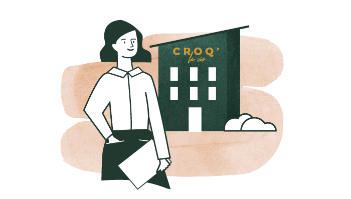
CROQ’ la Vie is a manufacturer of pet food for dogs and cats that prioritizes animal health. Taking a stand against the pitfalls of the agri-food industry, this family-owned business of breeders has put all its expertise into designing kibbles that closely align with the biological and natural needs of our pets. We collaborated to express the brand’s strength in an original and powerful way through a complete overhaul of its visual identity, website, and products. The goal was to create a strong connection between the brand and pet owners.
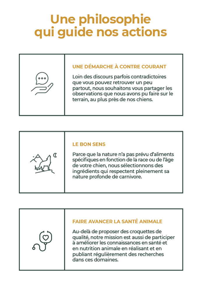
We started by analyzing the current state of the brand. Following an in-depth meeting with the founder, Davy Ros, we were able to identify areas for improvement, the company’s values, their mission, and their aspiration to go beyond just being a brand of dog and cat food.
The mood boards helped illustrate the best direction to take in line with the Ros family’s personality and the brand’s positioning in the market: scientific expertise, breeder experience, and premium quality products.
Results
Drawing on their years of experience and passion, we highlighted this differentiating factor to showcase their expertise, honesty, and determination to go against the grain of industrial practices with the new slogan « Breeder experience at the service of your animal’s health »
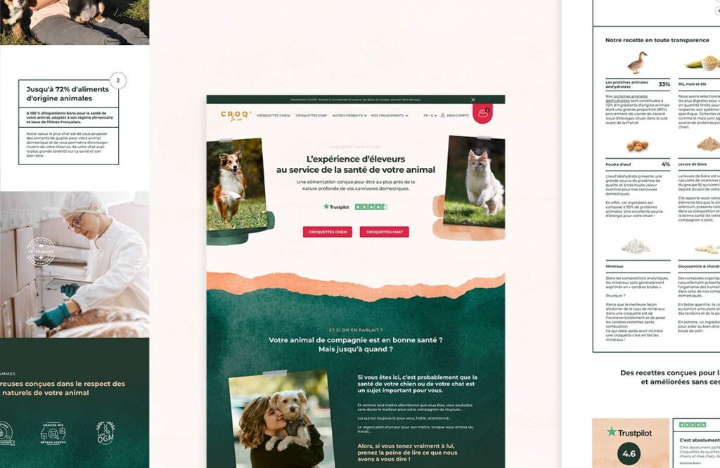
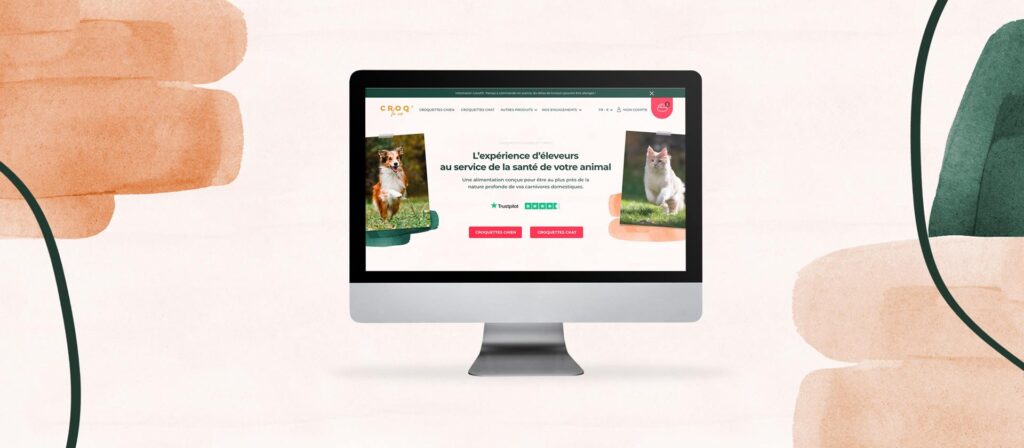
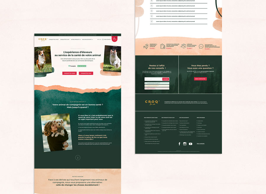
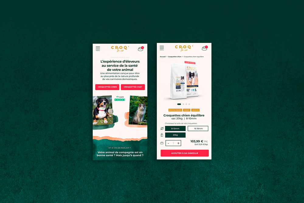
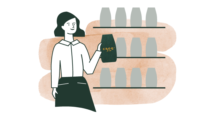
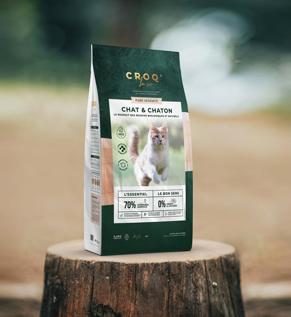
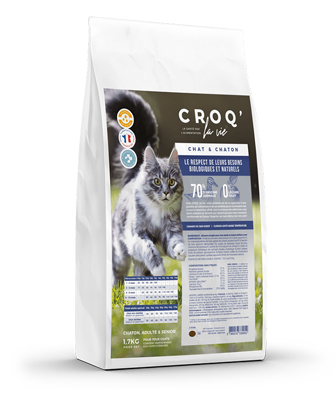
Far from the startup style currently in vogue, CROQ’ la Vie’s new visual identity draws on the emotion evoked by the love of animals with a photo album-style ambiance. The scientific seriousness is also highlighted through white colors, minimalist geometric fonts, and strict lines.
Finally, the authentic and natural aspect of the brand is reflected through textures and colors such as forest green and pastel pink.
Therefore, thanks to this redesign, we can see at a glance that CROQ’ la Vie now positions itself in the premium market for pet food and animal health.
Finally, service providers who are truly competent
We needed to find service providers who could truly immerse themselves in our company and understand the mission of our brand, what we do, and the results our clients get. We needed genuine creators, creators who also know how to communicate and challenge themselves to push this project towards excellence, to the highest standard. After years, we were finally able to redesign our website to reflect our brand, thanks to the work of Antoine and Karen. Their work speaks for itself: https://croqlavie.fr. Their skills allowed us to focus more on other areas of the company, enabling us to further improve our service to our clients. More than ever, we believe that choosing the right service providers is essential to successfully accomplish significant work.