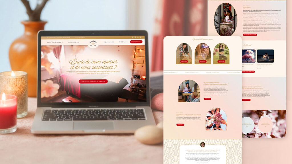
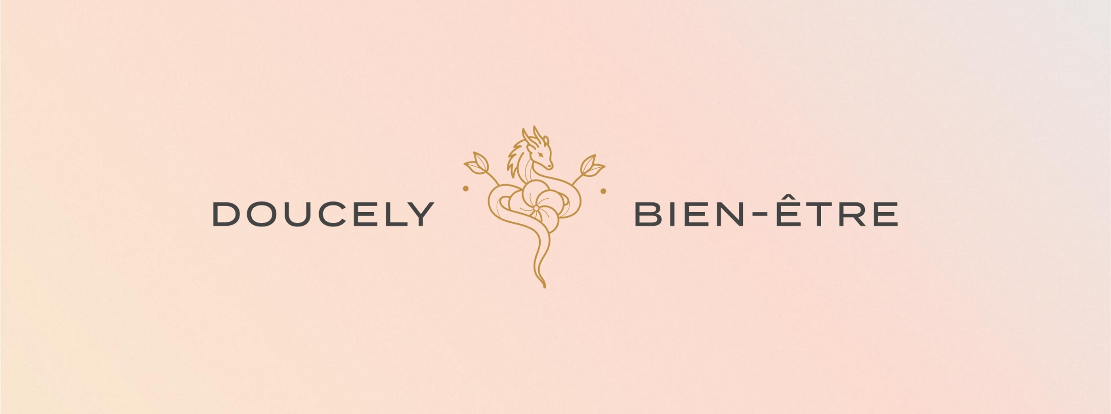
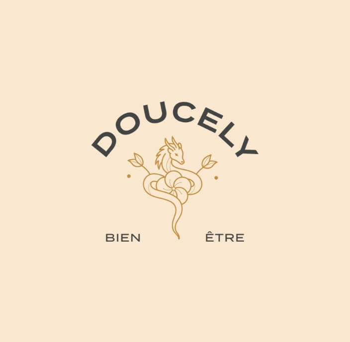
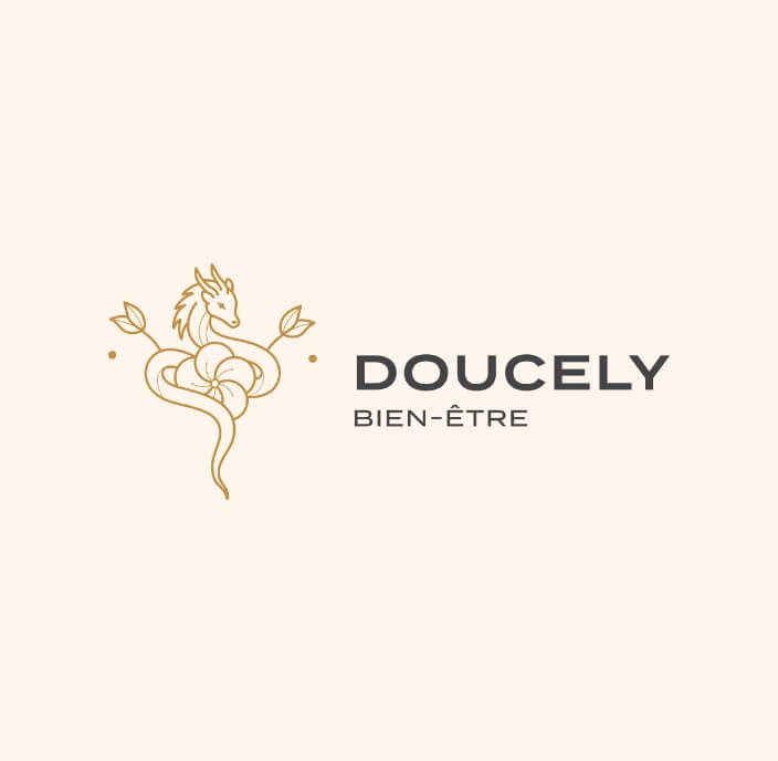
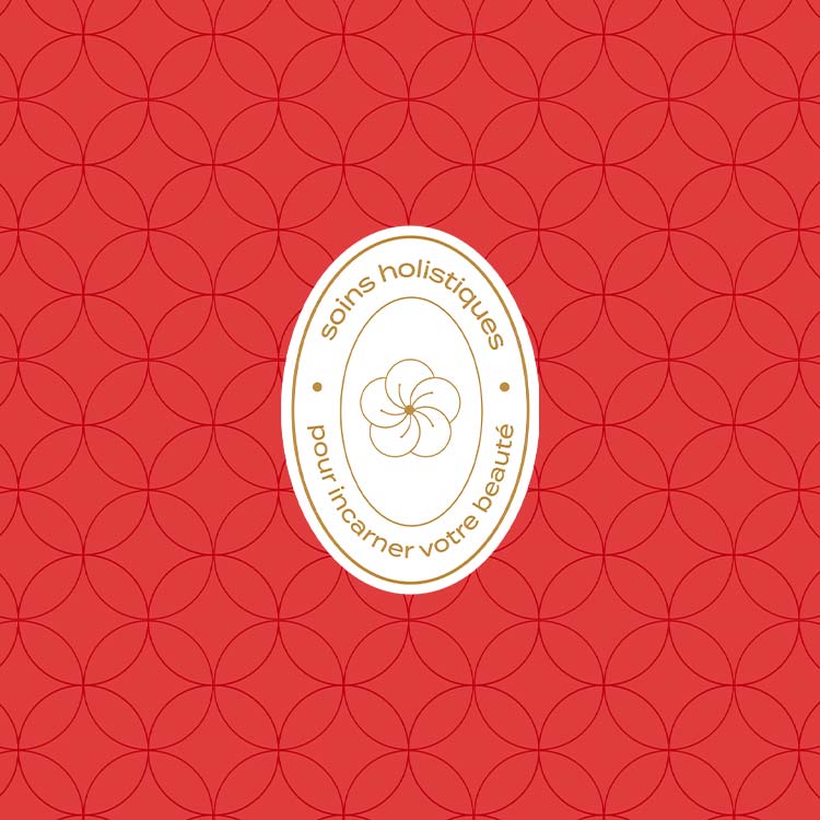
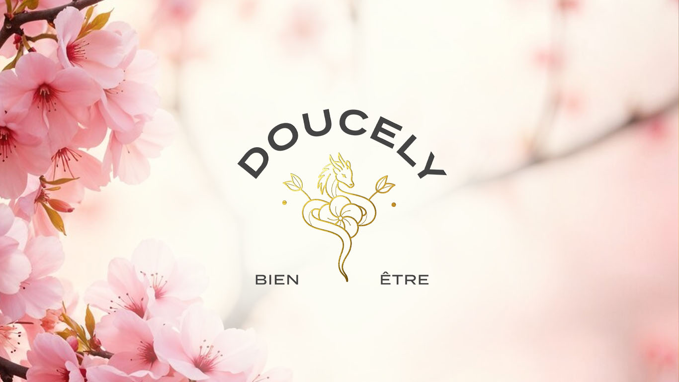
The Doucely logo is inspired by a fan, evoking a blossoming flower and symbolizing growth and energy. A curved typography enhances this dynamic, while the minimalist style conveys purity, elegance, and well-being.
The dragon, chosen by Amandine, represents strength and protection, deeply connected to Asian traditions and the energy of “Qi”. Its feminine design reflects gentleness and kindness.
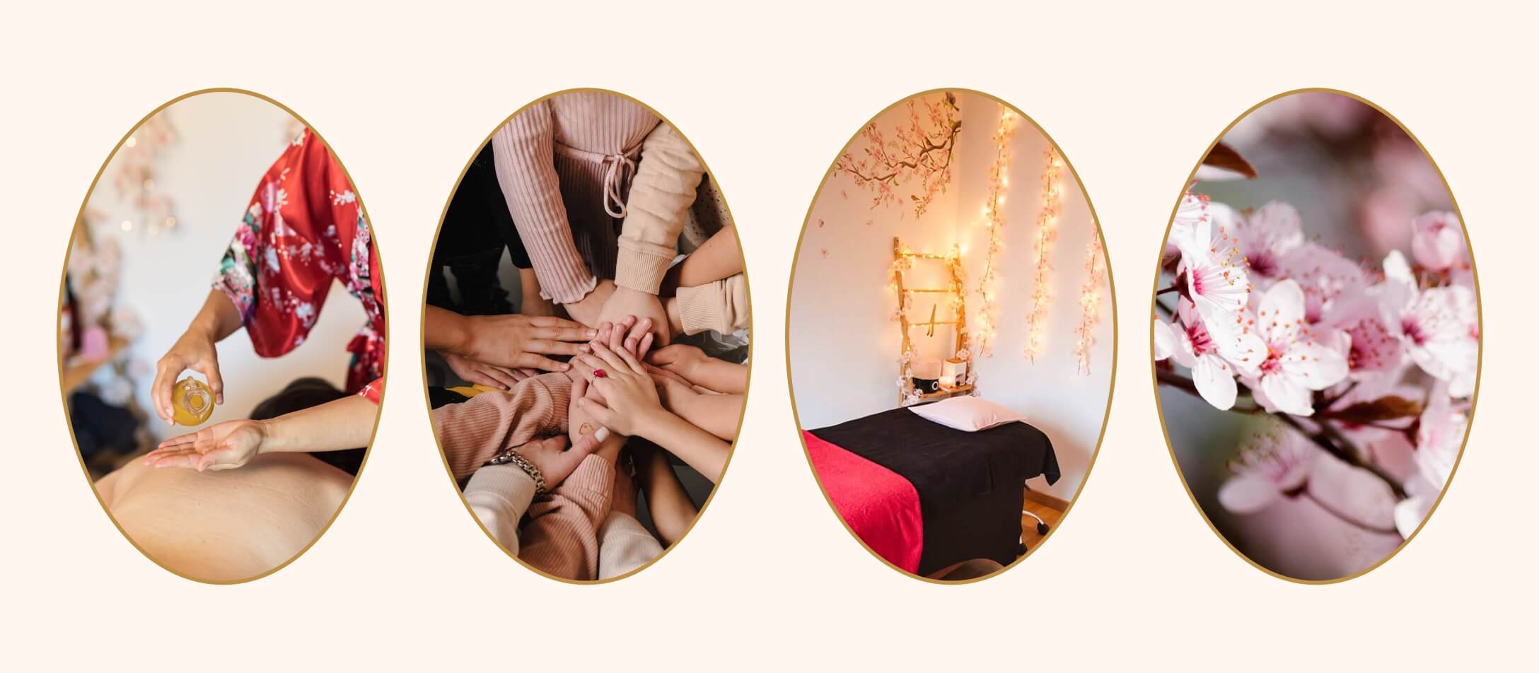
The cherry blossom embodies personal fulfillment and feminine energy, which lie at the heart of Doucely’s mission.
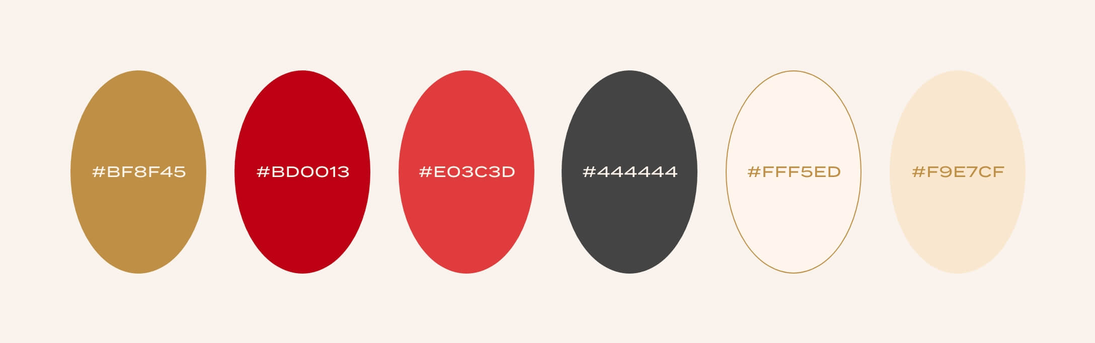
The color palette combines soft pink hues for gentleness, a touch of red for energy and Asian culture, and gold for richness and spiritual elevation.