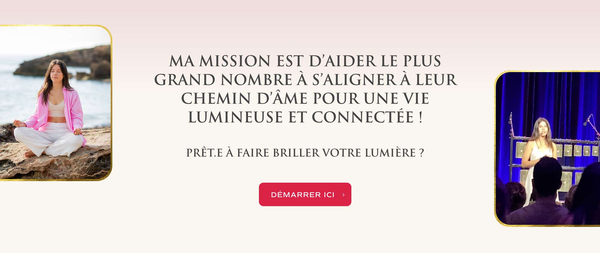
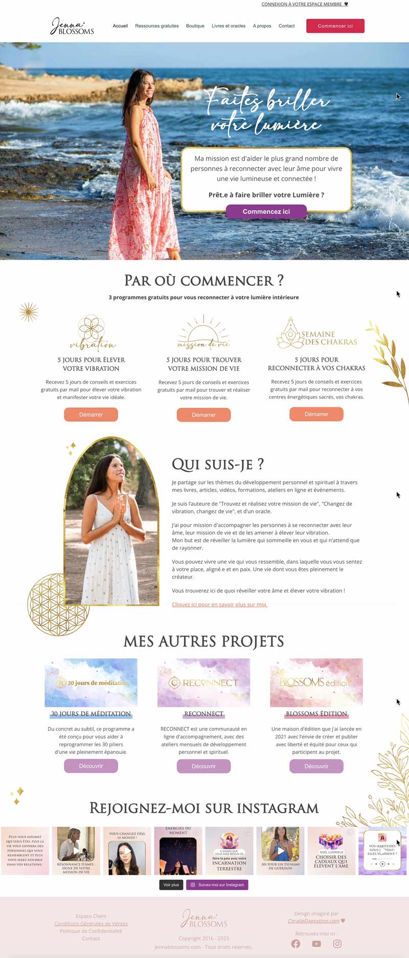
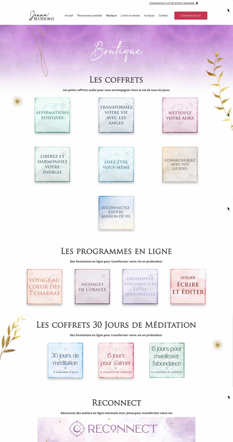
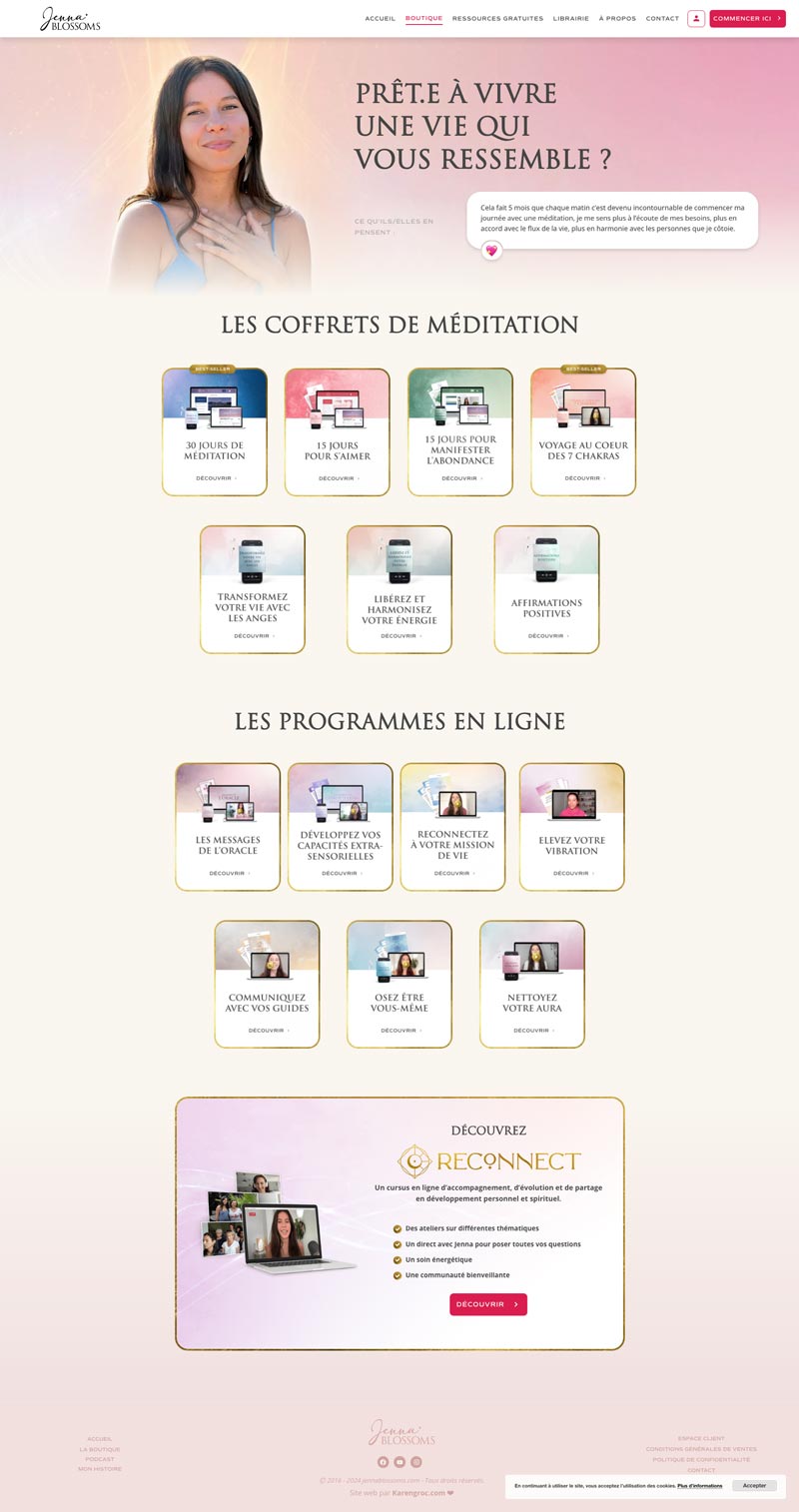
The overall identity of Jenna Blossoms embodies magic and spiritual energy through subtle sacred geometry graphics, luminous accents, and dynamic gradients.
The use of golden frames, inspired by oracle cards, enriches and structures the visual universe.
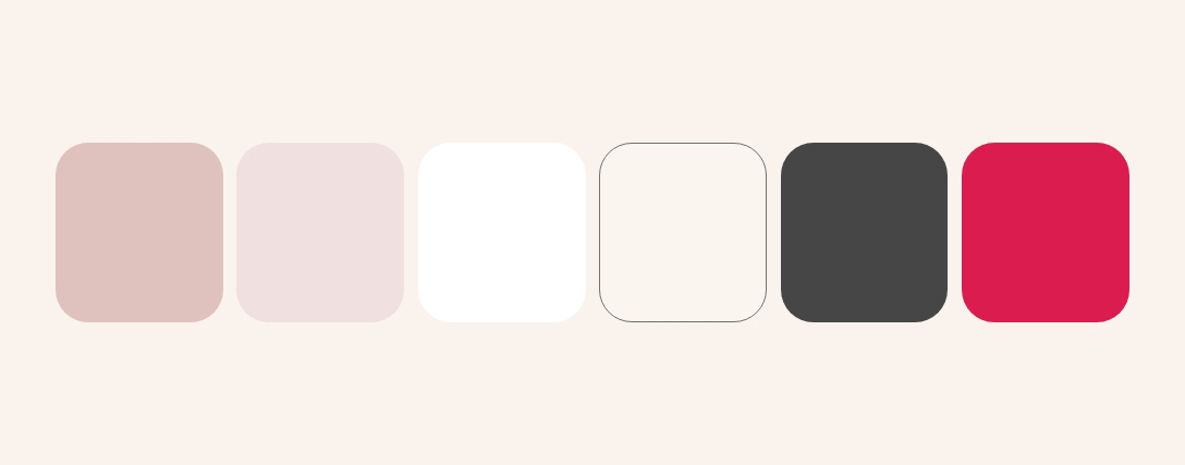
The visual identity is further enhanced by a soft pink color palette, reflecting femininity, gentleness, and authenticity. The combination of typefaces—blending the classic elegance of Roman-inspired lettering with a modern touch—adds refinement and prestige to the brand.
This elegant ensemble creates a professional, warm, and well-structured image, true to the essence of Jenna Blossoms.